The Board
Some time near the beginning of the COVID-19 pandemic, my friend Alex and I started building a lightweight social media application we’ve called The Board. Inspired by forums and BBS of yore, with the usability improvements of modern interface design.
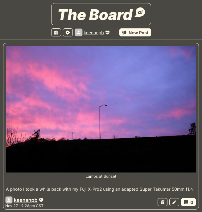
 The Board’s v0.2 homepage
Philosophy
Our main motivation was frustration with the existing social software offerings. It’s no secret that large networks like Twitter (now X), Reddit, and Facebook et. al have a reputation for producing toxic spaces. These networks are also maintained largely through advertising revenue, which rewards designing the platform for user engagement and retention, typically at the expense of user well being.
After some initial brainstorming we decided on a few things that would The Board unique, and most importantly something we wanted to use.
-
No voting system
Most contemporary social media apps employ some kind of voting, either single metric like ‘liking’, or the less common dual metric like upvotes and downvotes. There has been a fair bit of research conducted on the ill social effects of social media voting, but our main concern was the “regression to the mean” that can occur with posting when voting is the main affirmation of post quality or relevance. -
Simple organization
Our first attempt at post organization used post hierarchy to create a subreddit or forum thread like experience, but this ended up being convoluted and produced more questions about how to organize than answers. Going forward we’ve made tags the main method of organization, and in testing this is more usable and flexible. We’re also experimenting with allowing anyone to tag a post so organization doesn’t have to be determined when a post is created. -
Small and self host-able
Since we’re not in the business of maintaining a massive, centralized application at scale, it’s important for us that the codebase be small enough to maintain with a very small team. This means we can keep things simple and stable, and allow for easy extension and customization. We also want anyone to be able to host their own board on whatever hardware or cloud provider they prefer. -
Simple data model
From the beginning of development we wanted a simple data model so that post migration or export is feasible. Our original implementation used markdown as the data format with an off the shelf markdown editor, but we quickly ran into the extensibility limits of markdown. With our second rewrite we switched to HTML as our data format, which has been much more manageable and extensible. -
Invites
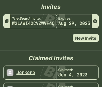
Initially this was a concern just to make alpha testing easier and safer, but eventually the invites became a more interesting feature. We realized that through invites we could track the growth structure of the network, and issue limited invites based on proximity to the root inviter. The invite tree also allows for moderation tools that prevent damage from bad actors.
 The Board’s invites
Visual language
When revisiting the look and feel after the first major iteration, I had a lot of difficulty deciding on a key color that should represent The Board. My main concern after a few experiments was a lack of personality and individuality. The solution for this that we eventually came to was to design the entire interface in a limited color pallette, and create a set of themes users can choose from.
 The Board’s theme selector
Themes only need 3 colors defined, and we have a script that will generate a theme from just 2 colors, the foreground and the background. One of the big benefits of this spartan design language is that it makes layout and alignment issues in the design very obvious. Contrast is also much easier to check, and visual accessibility has been improved significantly since the original design.
The low color, minimal design also gets out of the way of posts, so the content shines and isn’t overwhelmed by the UI.
The future
While we’ve made it pretty far with our currently running instance, we have already started another large rewrite to accommodate new features. You can follow our progress and learn more about our technical plans for the future at our repo on GitLab.